Behind The Labels
Julien Courtois, Loire, France
Heidi Kuka talks to us about the rich stories that her labels tell...
Often when we choose new wines, we make a decision by a combination of one or more factors: actual knowledge of the wine or producer, gut instinct, price or even an appealing label. When it comes to label artwork there is a range almost as varied as styles of wine: Everything from high-end domaines who commission famous artists for annual editions to winemakers who grace their bottles with the artwork of kindergarteners. For the last few decades supermarket shelves have been scattered with so-called ‘critter wines’ – with labels featuring various animals, insects, birds. These labels all share the similar ambition of easy recognition for repurchase.
But true artistic labels are another thing altogether. These labels are often wordless, aside from any legally required information. They may convey the story of the wine, the winemaker, or a bit of both. These labels offer an instantly identifiable image to those who know, becoming almost a secret handshake among fans. The artwork on the label, combined with the lack of words, creates mystery about the contents and in the story behind the design.
In The Beginning
When Julien Courtois first released his wines twenty years ago, his bottles had traditional labels. But one day he and his wife Heidi Kuka decided they wanted to switch to something more special; something that reflected the uniqueness of the wines they were handcrafting.
They wanted something simple to identify and that could be adapted per wine but also offer continuity amongst their range. And since the vast majority of their wines are sold outside of France, they thought a label without text would simplify matters as well.
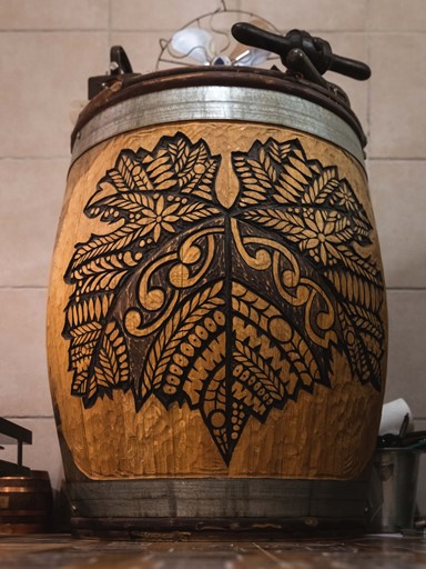
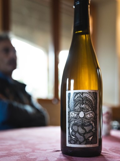
Heidi had been drawing as a hobby for many years, and her striking black and white designs seemed to tick every box on their list. Heidi says they made the decision quickly, “Julien and I decided to change all of the labels and use my art.”
Heidi is from New Zealand, and grew up surrounded by Maori culture and creative pursuits. “I always loved doodling and drawing, but never studied art formally. I loved colouring and exploring different media.” She eventually settled on India ink, as she was drawn by the simplicity and drama of black and white. “To have the most impact, there in nothing better than black and white” she says. Her style is uniquely her own, but is inspired by Maori tattoo art, called Ta Moko, as well as drawings and carvings she would see on the inside of marae (Maori meeting houses).

"My father is Maori, so all of my drawings have a tribal side to them.”
The Turtle & The Scarab
Each intricate artwork takes countless hours to create. Heidi struggles to find the time draw, then usually starts and stops several times, picking it up again when she is inspired. She says she needs a certain mindset to draw, but when finds the rhythm the ideas and images flow freely and it becomes an almost meditative act.
“Sometimes it’s so so easy, other times it’s like you’re climbing a mountain and it takes forever! Sometimes the page lights up and it’s like following the dots. Like I can see what I should do before doing it.”
The labels provide a visual shorthand - a link to nature, another culture and a deeper story behind the wine. All of the subjects are flora or fauna of some sort: butterfly, elephant, tiger, dragonfly. Some of these links are simple, like the label for their Elements wine, which Heidi describes as “A turtle who carries the world on it’s back”. Others tell richer stories. Their wine Autochtone is made from the rare variety Romorantin - the name translating as ‘rare’. Its label features an endangered scarab that is protected by EU law. This tiny beetle caused an entire motorway to be rerouted around its natural habitat. The label is a wink to the power of that tiny insect and of the Romorantin grape.

Spiritual Guardian
Their latest wine, Colére de Zeus, uses an image that is her interpretation of a Mania, a half man, half fish creature in her tribe. "He is meant to protect you and create a go-between between for you and the spiritual world. Like a spiritual guardian” she says. “It was my response to the worst year in terms of harvest, ever. So sad. When you are that low it helps to know that it is going to be okay. You get back up on the horse and continue.”
These images make an emotional impact as well as a visual one. Once the wines are opened, a sensorial link is made between the palate and the visual memory. Some of our clients will even ask for Courtois wines by the artwork. They can remember the graphic depiction of the butterfly and the delightful wine that was inside it, even if they can’t remember the name Originel or the grapes Romoranton and Orbois.
Even though Heidi Kuka’s designs have been shown in several exhibitions in France, she dismisses artistic ambitions and insists her focus remains on making wine with Julien and running their domaine. Both of their talents there are evident; as their wines are some of our favourites from the Loire. We look forward to any new cuvée from them for both the exciting wine inside and for another edition of Heidi’s gorgeous art.
View WinesPhoto Credit Matt Hickman
Words by Allison Burton-Parker


